Let’s get this out of the way right now, the Las Vegas Raiders do not need to change a thing, nor should they. However, if Mark Davis does decide to shake things up a bit and do a little rebranding ahead of the team’s relocation to Sin City, here are four tweaks the Raiders could adopt that I think even purists like myself can get behind.
1. The Raiders Logo
Since moving to Los Angeles, both the Rams and the Chargers have made changes to their logos. The Raiders don’t really need to to do this because their current logo is pretty much perfect. The only fathomable template for an acceptable redesign would be the throwback logo. That white background and the black swords just slaps different. That being said, I wouldn’t want to just go back to the old logo, the black helmet and black swords look weird plus the guy with the eyepatch looks less menacing and almost like he’s smiling. If they were to change the logo (again, they shouldn’t), I think a hybrid between the throwback and the current logo could look really neat. And speaking of throwbacks…
Related:Â Late Round Sleepers Raiders Need to Look at
2. Make the Road Jersey White with Silver Numbers
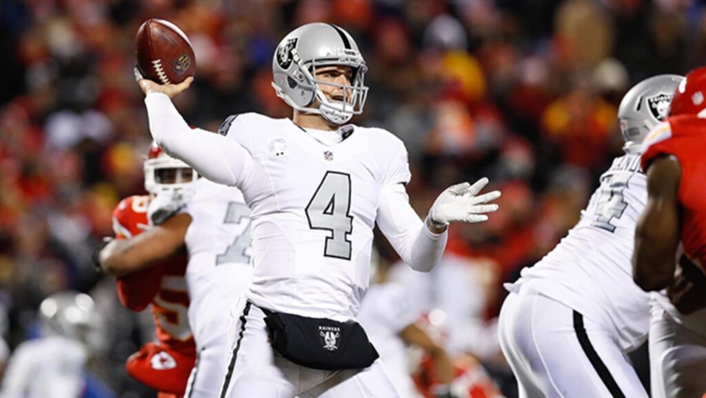
Simply put, this is the coolest throwback jersey in the entire league and it’s not even remotely close. I think that most fans would agree that this is the one uniform change that you could argue that the Raiders actually SHOULD make. The Saints have recently started wearing their white jerseys with gold numbers more and more often and it has gone over very well. Currently the Raiders white jersey with the silver numbers is their alternate/color rush jersey. By making it the permanent road jersey, they would open up space for a new alternate/color rush jersey.
3. Silver jersey with black numbers
Ahh, the mythical silver Raiders jersey. You could use it in some versions of Madden, NFL Shop sometimes sold it, but you never saw the Raiders actually wear it in a game. It’s like jersey fan fiction. Anyways, it would make for an awesome color rush uniform. Some people have suggested a black color rush jersey with black pants and/or a black helmet and that just feels like too drastic of a change. A silver jersey would be much more subtle, and it would look good with my last suggestion…
4. Two Words: Chrome Helmets
This is probably my most outside the box idea yet, but hear me out. It wouldn’t be a huge jump to go from silver to chrome, and it would look good under the bright lights of the new Allegiant Stadium. Several college teams have pulled it off, and the Raiders have a better color scheme to do it than any of them. Also, if you want to see what a chrome helmet looks like paired with the silver and black, look up the Kings stadium series uniforms.
I want to reiterate that the Raiders do not need to change a single thing about their current look. These are just some things that would be acceptable should they feel compelled to do so. Some have suggested much more wild changes such as adding gold to the color scheme to match the Vegas Golden Knights. Those people are maniacs who need to be locked away forever.
You May Also Like:Â Reggie Robinson Draft Profile
Top picture via the team’s official website.
Raidas always had the coolest uniforms and chrome helmets would be the absolute coolest
I vote for reflective uniform numbers and nob with chrome helmets.